For this reflection, I will compare my KPI (Key Performance Indicator) analysis during Week 7 with how I see it now, relate it to the work produced and analyse the quality of the work I produced.
Starting from Week 6, it was required of us to do 30 hours of studio work per week and lodge them. This only included project work, not side tasks such as writing the learning contract and blogging. I found it difficult to contribute 30 hours a week when I also had so much other work not related to the projects. Despite this, there were two weeks, when I successfully managed to do over 30 hours of project work. In retrospect, I feel this could have been better avoided with better time management. If it was planned much earlier yet also being realistic, it may have improved my work ethic and allowed me to adequately contribute to each area.
I feel that I was somewhat unsuccessful in the area of teamwork since most of the work I contributed to the "Before There Were Bears" project and "Voodoo" project were not included in the final pieces. The 3D version of the bedroom for the Voodoo project was only used as a reference for lighting. There was also some communication problems at times as I was unable to be on Slack as often as required. There were four times when people had difficulty contacting me due to this.
Despite these issues, I'm satisfied with my willingness to get involved with other projects from early on and I'm glad I chose to leave the major project when I did to give myself more time to focus on my solo project and especially since I knew I didn't have the skills to make final models up to the standard for the major project, "Before There Were Bears". I'm also glad that my colleagues were always friendly with each other and never patronizing towards each other despite having these issues.
Looking back at my KPI analysis in Week 7, I feel it was wrong to have claimed to have been masterful in the areas of positive attitude, acting as a team player and the ability to accept and learn from criticism. Although I can understand why I felt that way at the time, I realize I wasn't performing in those areas to the standard of the uni and still have a lot to improve on. I look forward to improving myself in these areas with the challenges I will face in my professional life.
I claimed to be successful with effective communication skills, time management and flexibility and adaptability back in Week 7. Once again, I can understand why I felt that way at the time although I realize there is much more to improve on especially looking at my performance over the past six weeks and two days since then. Also, I pitched the Lighthouse solo project in Week 6. It would have been much more convenient to have pitched it as early as Week 2 or Week 3.
I claimed that my problem solving skills had room for improvement back in Week 7 and I still feel that this is the case as I often had to search for solutions for my problems. However, I'm sure that with more practice, I will be able to solve at least some of my problems alone.
On a more positive note, I am satisfied with my effort throughout the trimester to ensure all work was completed although at times I rushed. I never missed any strict deadlines. Although my skill level is not where I feel it should be, I'm happy with what I've learned and feel that I'm slowly improving with the program, Maya. I'm also satisfied that I managed to work diligently and friendly with my colleagues and were able to communicate our needs clearly.
I'm also happy that I was able to work with the level of pressure at times, my willingness to get involved with other people's projects and some of the ideas I came up with. I also feel that I am able to accept and learn from criticism even though at times, it can feel very harsh. I try to remind myself that the criticism is not intended to defeat my confidence but teach me to improve myself.
Ultimately, I am quite satisfied with my effort for this unit although I feel there is plenty of room for improvement. It was unfortunate that I had to be less involved in the major project, however this allowed more time for me to work on the Voodoo project and Lighthouse project. My role in the Voodoo project was small but I felt it was successful.
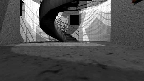
Finally, my Lighthouse was not what I considered to be a folio piece and rather, a decent template. I feel it could have had more detail as it feels somewhat lifeless and doesn't effectively communicate the idea that a person lives there. Despite this, I'm not disappointed that it wasn't as big as I originally pitched it to as it was originally far too ambitious, given the timeframe to work on it as well as balancing with other work. I'm not at the skill level to have been able to made the lighthouse a folio piece. However, with more practice with Maya, I believe I will be able to improve myself in the future.
I plan to use everything I have learned from this reflection about time management, effective communication skills, problem solving skills, acting as a team player in the upcoming trimester.
ANM230 - Animation Studio 3 Blog
Thursday, 27 August 2015
Week 13
A mistake that happened the second time I rendered was not including the light on the top floor.
Another was not including the texture on one part of the light.
From that, I learned the importance of making sure all appropriate details are included in the render layers.
On Wednesday and Thursday, the last two days of class, I polished my Flythrough project and on Thursday, presented it. I also worked on my showreel and post mortem to ensure I was meeting the learning outcomes for that include the showreel and post mortem.
Sunday, 23 August 2015
Week 12
This was the first attempt I had at making a flythrough by keyframing a camera. After this, I found that attaching a camera to a motion path was the better way to do it.
This was the surrounding environment box that I put around the lighthouse in case any light went through the glass windows but the light didn't escape.
I added some windows in the entrance windows for some extra detail.
I smoothed the edges of stairwell which I felt improved its appearance.
There were some problems the first time I rendered so I fixed them. For example, the windows I included near the entrance weren't noticeable enough and the stairwell was too dark.
The black mark on the picture frame on the middle shelf is because of a black book that was directly behind it. I moved it to the left with the other books.
The stairwell that connects the second floor to the top floor and the top floor were far too dark. To fix this, I moved the lights in the second floor and added extra lights to the top floor.
I moved a light closer to the stairwell that connects the second floor to the top floor which gave a better lighting effect.
I tried also putting a point light in the top floor and moved lights around on the lower floors.
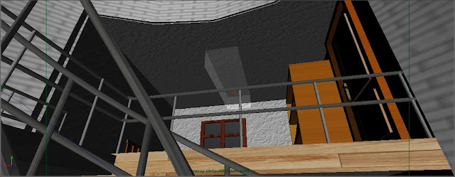
I added a door to the bedroom for some extra detail and I felt it was believable. I was also quite satisfied with the textures I chose.
This is how the top floor appeared with an area light and a spot light.
This is how it appeared with an area light, spot light and also a point light. I thought this had a much better and believable effect.
Sunday, 16 August 2015
Week 11
I created the effect on the mattress by bringing the vertices down and smoothing it. I created the effect on the pillows by making a polygon cube, applying nCloth to fill it up and then duplicated it. I pressed play, paused until I was happy and then deleted history. For the blanket, I applied nCloth to a polygon plane with many faces. Again, I pressed play, paused until I was happy and then deleted history. I also made the mattress a passive collider so the pillows and blanket would not just endlessly fall.
On the left are the first mattress and first pillows I attempted but was unhappy with their shape.
Here are close-ups of the first book I modeled and then duplicated several times.
The progress with the bookshelf at this point.
The simple polygon cylinders I made when starting to make a ladder.
This was the early stage of the top floor. At first, the gaps between the rectangular prisms were smaller and I felt they needed to be bigger. I was happy with this result.
I felt that the roof shouldn't be flat. Even though the audience won't see this view in the final view, I felt this effect would make for a more interesting ceiling in the interior.
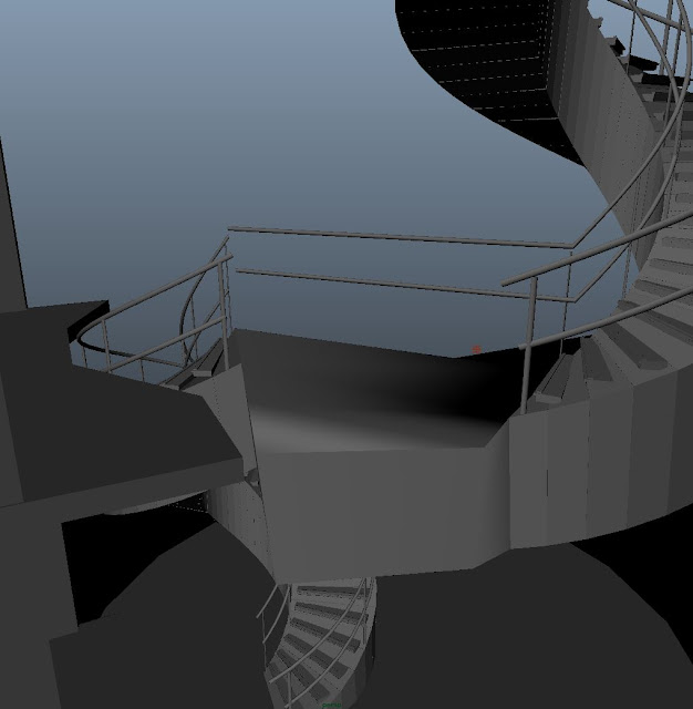
This was the original hole in the top floor to allow the spiral staircase to enter it and also how the platform where the two spiral staircases met led to the bedroom.
I didn't like the design of the floor with a big asymmetric hole in it so I deleted it.
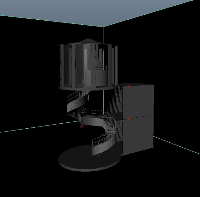
This was Edden's example of a way to make the middle floor connect the top and bottom floors.
This was the view of the bedroom from the middle floor. I decided to have point lights in the entrance room and the bedroom.
I had the front faces of the light at the top of the lighthouse converted to a glass-like material except at the middle because I imagined the little circle at the front to be like a lid. I also put bent some cylinders to make a railing around the light. I had a light placed here but it needed to be stronger than a point light. I had a spot light placed there.
At the time, this was the view from the outside. I also had the glass-like feature applied to polygon planes that I placed around the top floor.
I noticed that this problem was happening with the blanket. I was told that all the faces on the opposite side were causing this problem.
I deleted all of those faces underneath and as shown, it fixed that problem.
The cylinders used for the railings had far too many subdivs so I reduced them. It was unneccessary for them to have as many as they did. I felt it was pointless for them to be so high-poly. I deleted the faces of these poles and put some edges in to stitch them up.
I deleted the faces at the ends of the vertical poles of the railing since they won't be seen anyway and so that there's less poly on the poly count.
I had the same issue with the roof at the top of the tower that I had with the blanket of the bed. I fixed it the same way.
I also thought it would be interesting to make it cone-shaped as I felt that would be more interesting in the interior than a flat ceiling.
I also changed the hole on the top floor that allows the staircase to enter to how I felt looked more presentable.
Subscribe to:
Posts (Atom)


